Splice
At the beginning of the title sequence, we are shown an x-ray image of what seems to be a frog, and it suddenly merges into an institutional logo. The non-diegetic sounds include a buzzing/zapping sound which accompanies the merging effect, which suggests malfunction and broken technology. This creates an eerie atmosphere, and straight away generates enigma and intrigues the audience. The colours being black and a ghostly blue, create darkness and gloominess, which indicates the Thriller genre of the film, due to the way the audience are plunged into darkness within the first few seconds of the film starting. This merging effect continues for a few more seconds, as it introduces the other institutions that are part of making the film. Between each merge, the image flickers slightly, which creates a sinister feel to it. The effect of having the institutions right at the beginning, allows the audience to understand the type of film it is, and it also creates a build up to the title itself.


As the opening progresses, the institutional information becomes directors and actors names. The font becomes veiny, tissue like, and attached to the background; revealing that the film could be about bodies and skin. The structure of it now showing the actors names, shows us how it's progressing to the title. The names of people responsible for make-up, costume, editing, sound, etc. begin to fade in and out, in the same size, font and colour as previous institutional information, which again, builds up to the title, but it also allows the audience to see who's responsible for the upcoming events in the film.


As the camera travels through these passages, the pace increases to and fro the passages, which creates tension and suspense. When we are finally shown the title, it appears underneath some skin, looking like veins and vessels. It's big in size, and is positioned in the middle, but slightly slanted, which makes it seem distorted. The way it almost grows and appears from underneath skin, makes it very disturbing and unnerving to watch, which reflects the Thriller genre. The colour of the title is a very dark blue but slightly grey, this is to achieve the veiny look and to make it seem like it's part of this living thing. The effect of not knowing who this skin belongs to, creates enigma and intrigues the audience. The title is dramatically introduced by the non-diegetic music, as a crescendo announces it. The title also beats like a heart beat, this is emphasised through the subtle non-diegetic sound of a heat beating. This makes it seem creepy and alive.
'Splice' also sounds a lot like 'slice' which has connotations of blood, surgery, knifes and pain. This is to reflect the Thriller genre, and to indicate subtlety what the film is about, also, the effect of it just being one word adds a dramatic touch to it.
After the title is shown, the directors name fades in, which is the last piece of institutional information we see, this is to highlight the importance of this person.

The Game
At the start of this sequence, institutional information immediately appears, accompanied by eerie non-diegetic music, which sets up a mysterious atmosphere. A fade to black is used, to introduce the film company, which is presented using a thin font, fairly middle sized, and in the colour white. Once again, white is used to make it stand out from the black gloomy background, and to suggest coldness and emptiness. The text decays, and breaks up into puzzle pieces to reveal the next piece of text. The crisp non-diegetic sound of shattering portrays a sinister feel to the audience and reflects the Thriller genre. This same effect is used with the second bit of institutional information, and for the title itself. The reason for this effect is to work together with the title, as a puzzle itself is a GAME. Games have connotations of fun and childhood, which could be irony, considering it's a Thriller, it could be to deliberately contrast with the events that take place in the film. The reasons for displaying the film company and then the title, is to prepare the audience for the upcoming events that creates an outline of the plot, and to also build tension.


The title fades to black, and an old fashioned clip appears of a man and a boy, perhaps a Dad and his Son. The clips flicker a lot, which is to generate a sinister atmosphere, and enigma. It also seems vintage, maybe to suggest it's in the past? We see a lot of children running around looking happy and enjoying a puppet show, perhaps to disturbingly reflect the name of the title? The cuts between the clips seem to be disjointed, jerky and distorted slightly, this is too represent the Thriller genre. The pace is quite slow to generate an uncomfortable atmosphere.
The non-diegetic music sounds calm and slightly old-fashioned, which works together with the old fashioned camera effect used.
The absence of diegetic sound makes it seem more creepy, due to the way the actors are silently acting. Some of the actors also look right into the camera, which directly addresses the audience, which makes it uncomfortable to watch.
The clip of the Dad and Son is repeated near the end of the sequence, which suggests these are two important characters.
There's a sudden cut to a man washing his face, which makes the audience jump, due to the abrupt ending to the previous scene.


Buried
The first part of the sequence displays the institutional information of companies involved. The font is quite block-like and thick, maybe to represent how deep underground we are. Half of the text is in brown, and the actual name of the company is in white. Brown has connotations of dirt, mud and nature, which is to reflect the title. The white allows the company name to stand out on the dirty background that it's placed on. The background is a wall of dirt, again to reflect the title. The text sort of gets sucked/wiped off the screen upwards, showing how we are progressing deeper into the earth. Menacing non-diegetic music plays in the background to emphasise the Thriller genre, and to create a sinister atmosphere to intrigue the audience.
One part of institutional information is accompanied by stripes of light yellow and one of the stripes display what looks like cracked mud. These stripes push the text upwards, and each time the stripes appear, more of the cracked mud image is revealed. They seem to tunnel their way through the screen, which again reflects the title.

The non-diegetic music becomes less menacing and dramatically introduces the title by the use of a crescendo. The sudden silence creates a bigger impact for the arrival of the title.
The title slowly fades out, which allows the non-diegetic music to become louder again, in order to generate tension and to build up to the upcoming events of the film.
Having the title appear so early, allows the directors name to appear more significant at the end of the opening sequence.
The word 'buried' seems more disturbing when it's used to name a Thriller film, as the audience expect someone to be buried. Also, it has connotations of restricted movement and small spaces, which is very unnerving and would be uncomfortable to watch.

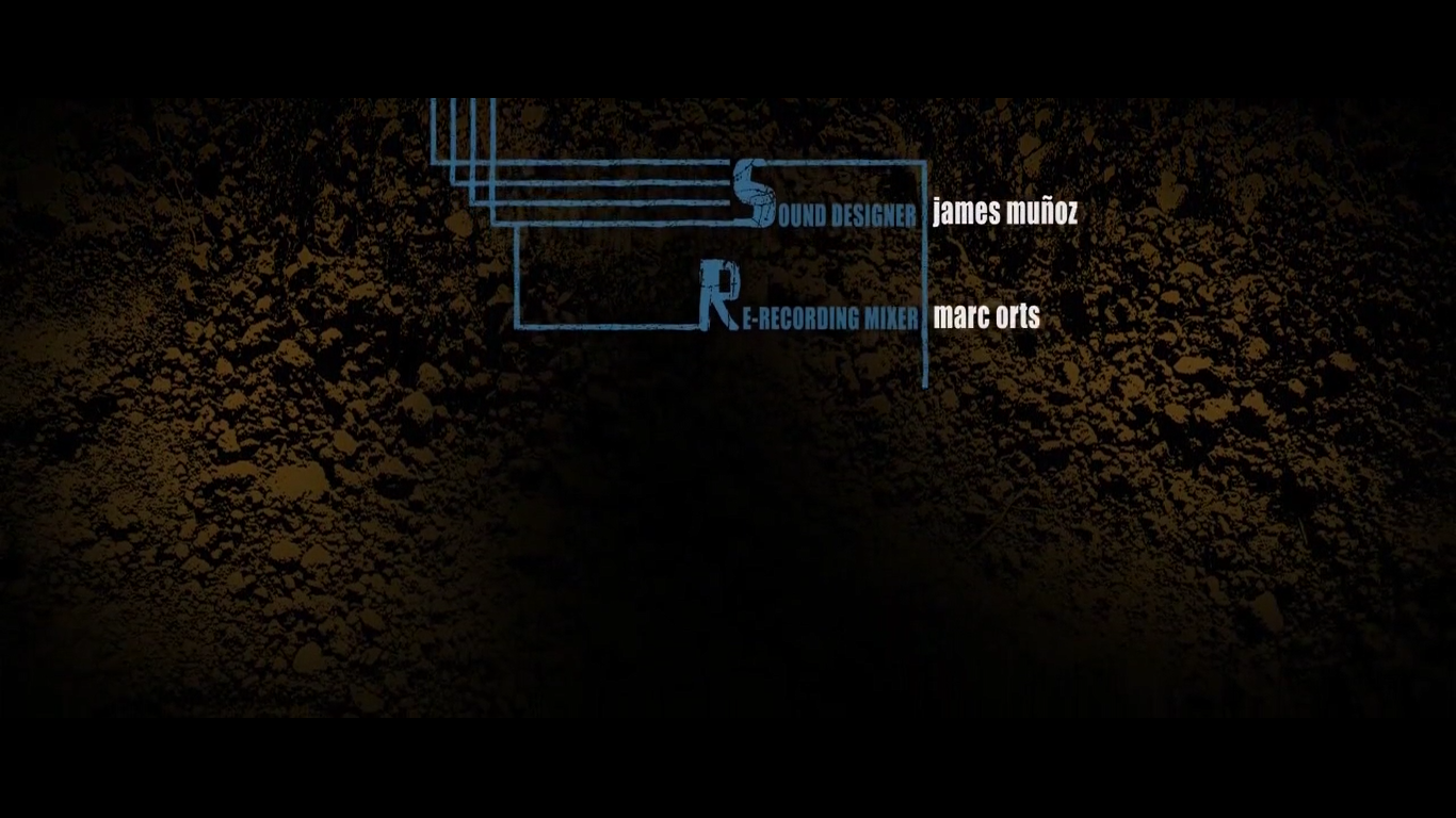
More institutional information about who's responsible for certain things are constructed by blue lines that tunnel through the soil, like a mole. This creates more pace, especially with the menacing non-diegetic music playing alongside it.
The yellow stripes come back, and we are able to see objects that are split up into individual stripes, such as dollars, and towers. This generates enigma for the audience, as we wonder what's so significant about them. The dollars are obviously shown to represent America.


The last piece of institutional information displayed is the director. It's significantly last in the sequence to emphasise the importance of the director. The non-diegetic music announces the text by coming to an abrupt stop, making it seem more dramatic.

Excellent work Zoe - level 4! Can you now get your team members to minimise lost marks by posting theirs by tomorrow at the latest?
ReplyDelete